UF Quest
<New Site>
We worked with the Provost Office to create a site for the UF Quest program.
Provided by the client
text content and site structure
the diagram
the Quest logo
the wireframes, on paper
My contributions
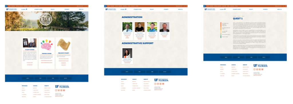
Homepage Banner For the landing page, I chose an image from the UF photography repo that reflected the elements of the logo — the water, sun, trees, and path — and applied a gentle overlay.
Sidebar For the subpages of the site, we wanted to try something different. The original sidebar in the UF 2015 template was designed to be a bright orange that had to be adjusted to a darker orange for accessibility purposes. Since so much content on the proposed Quest site consisted of text, I decided to use the sidebar navigation to add a pop of color.
I chose the colors based on the nature imagery of the proposed logo, making sure they were WCAG 2.0 accessible with the text color.

Staff Bios For the staff page, the mockup I received displayed squares for images and a short bio, so in that spirit, I created a polaroid theme.
Implementation
I created the custom content types in TERMINALFOUR using HTML/CSS/JavaScript and handed it off to the Provost team, who filled in the rest of the content. The site went live and can be seen here.